Twenty Twenty Therapeutics is a medical company which focuses on preventing vision loss. As a contract visual designer, I worked with Twenty Twenty to develop a company-wide brand guidelines document from scratch. This 30-page handbook provided easy-to-use guidance for applying the branding system across digital and printed materials.
MOODBOARDS
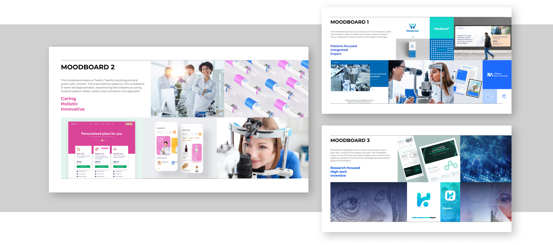
Communicating Holistic Patient Care
Twenty / Twenty offers a wide range of connected physical and digital products that support vision loss prevention. In developing their visual brand identity, I explored several directions which would highlight different value pillars of the company such as their patient-focused mindset, technological innovations and integrated expertise. The chosen direction for the branding communicated that the company is caring, holistic and innovative in every aspect of its approach.
CONTENTS PLANNING
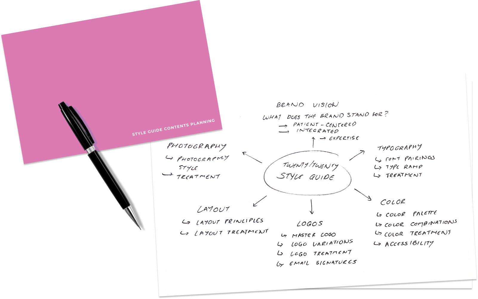
Keep it Short and Sweet, but Scalable
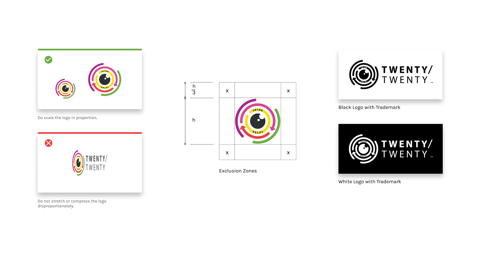
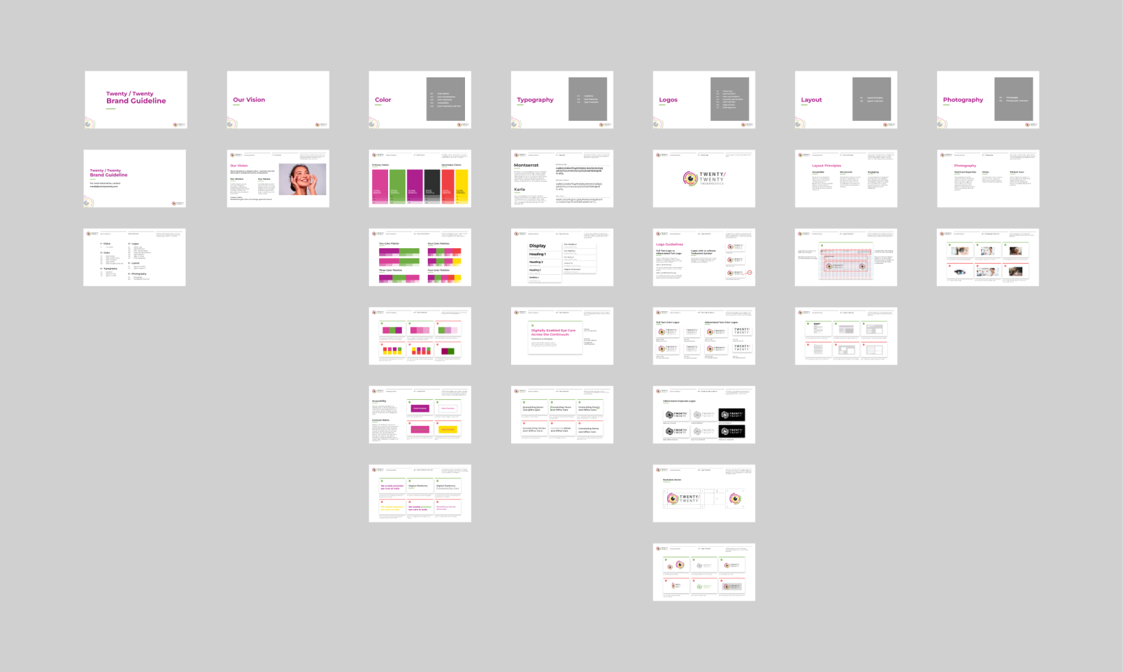
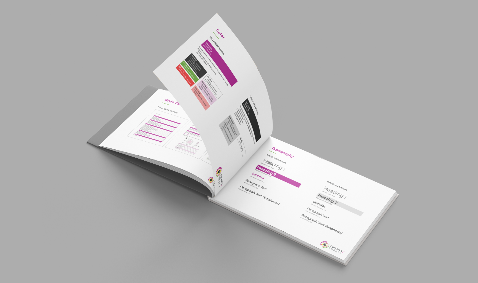
The brand had an existing logo and color palette which I needed to incorporate into the style guide but otherwise, all of the additional requirements needed to be defined. Collaborating closely with the client, I identified the essential sections needed to represent the brand effectively. Through iterative refinement, I developed a content structure that is both easy to reference and scalable, ensuring the style guide serves as a clear and adaptable resource for the brand's visual identity.
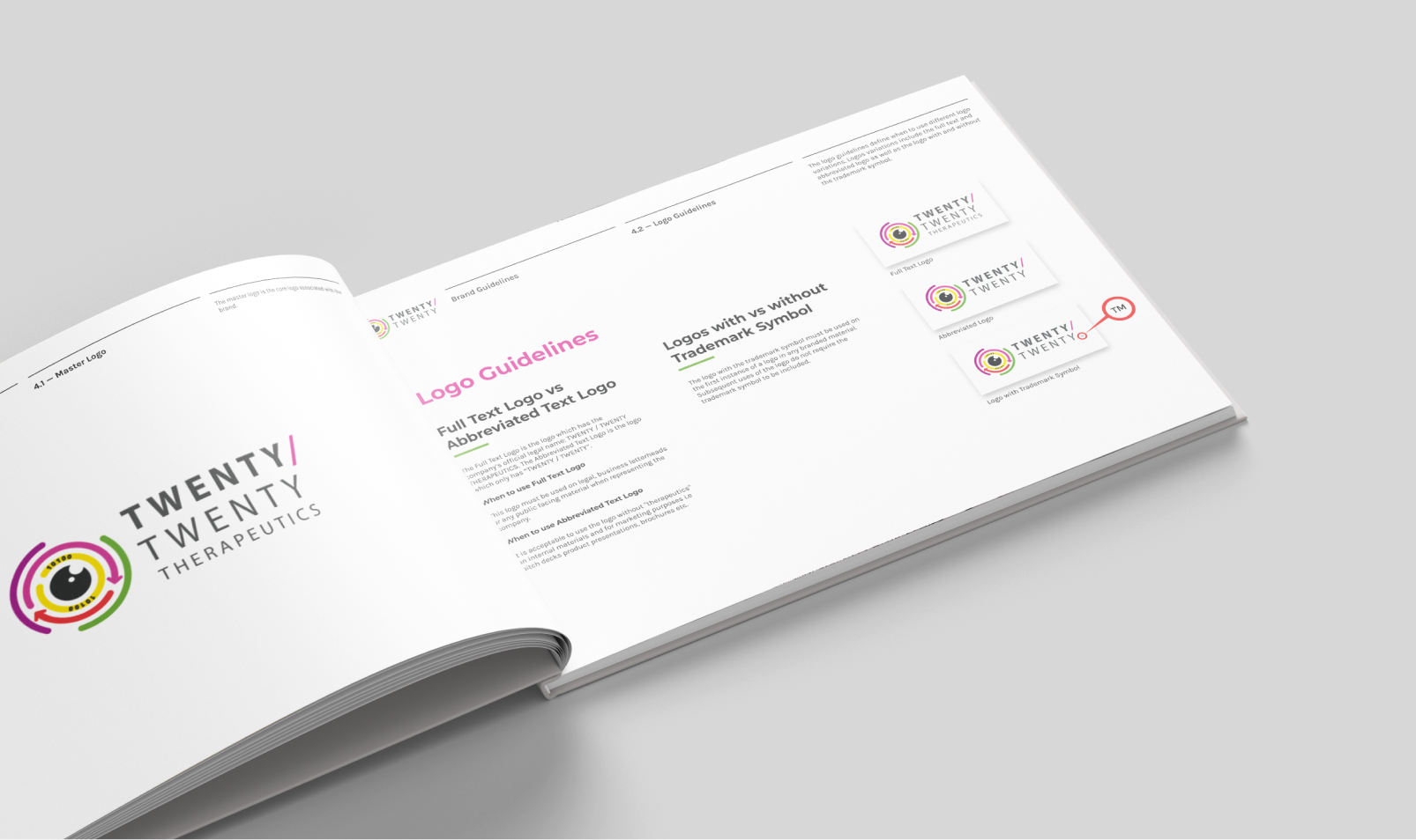
THE FULL STYLE GUIDE DOCUMENT
A Resource for Brand Consistency and Growth
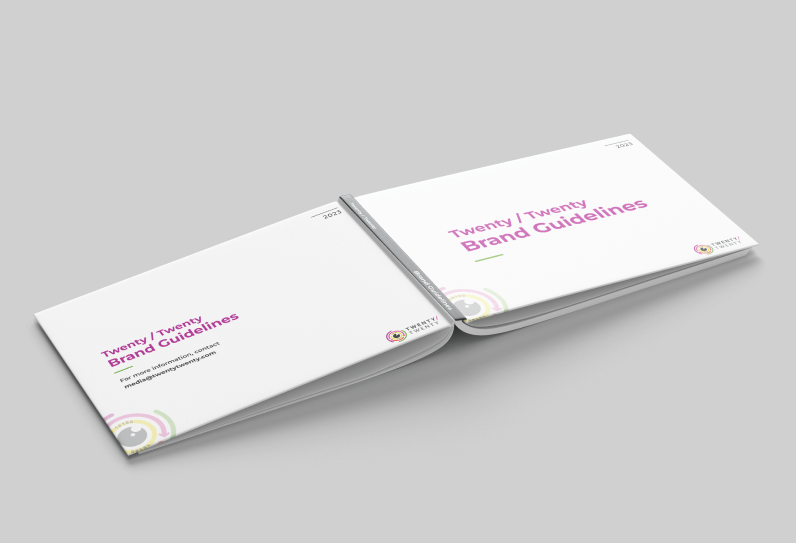
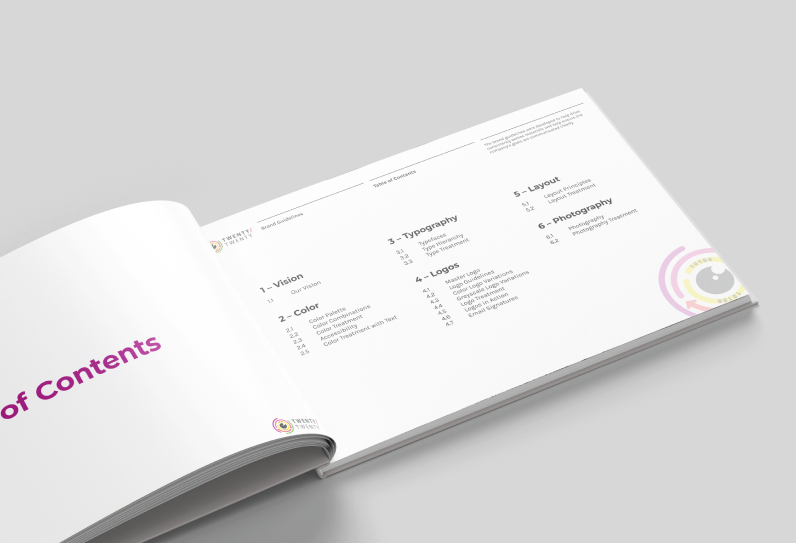
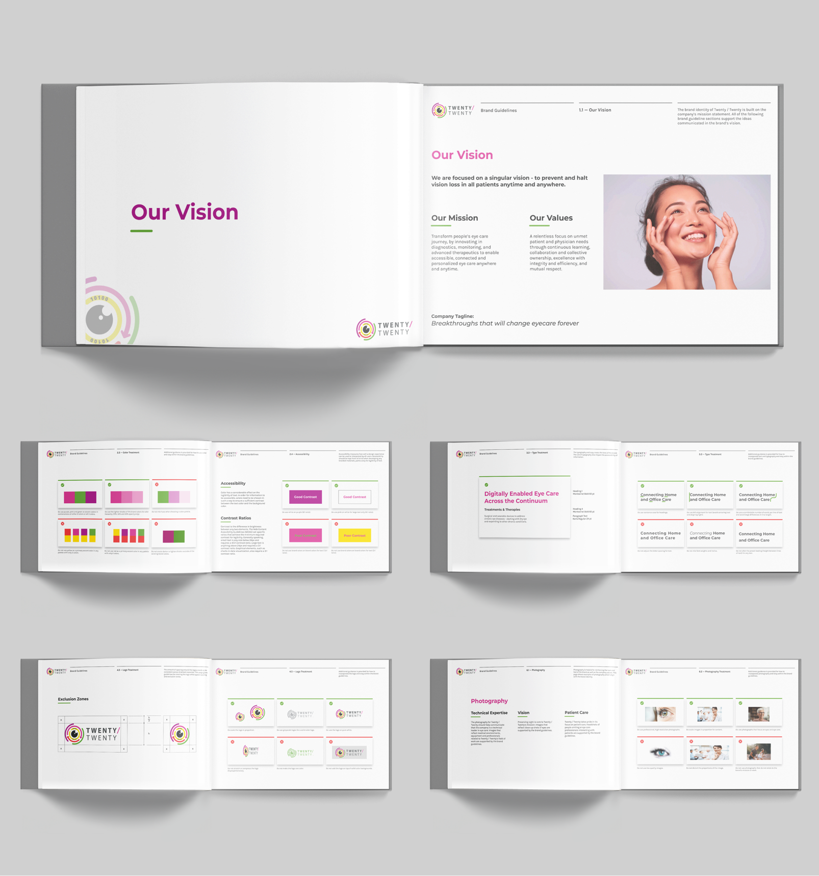
The comprehensive 30-page style guide serves as a useful resource for Twenty / Twenty, offering detailed guidance on using the brand’s colors, logos, photography, and visual layouts. Before this project, no formal brand guidelines existed, making this document an important tool as the company expands. The guide was refined through multiple feedback rounds, ensuring that it is easy-to-use and functional. Designed with flexibility in mind, the guide accommodates the unique needs of current product streams while remaining adaptable to future developments.


USER MANUAL STYLE GUIDE
Extending the Style Guide
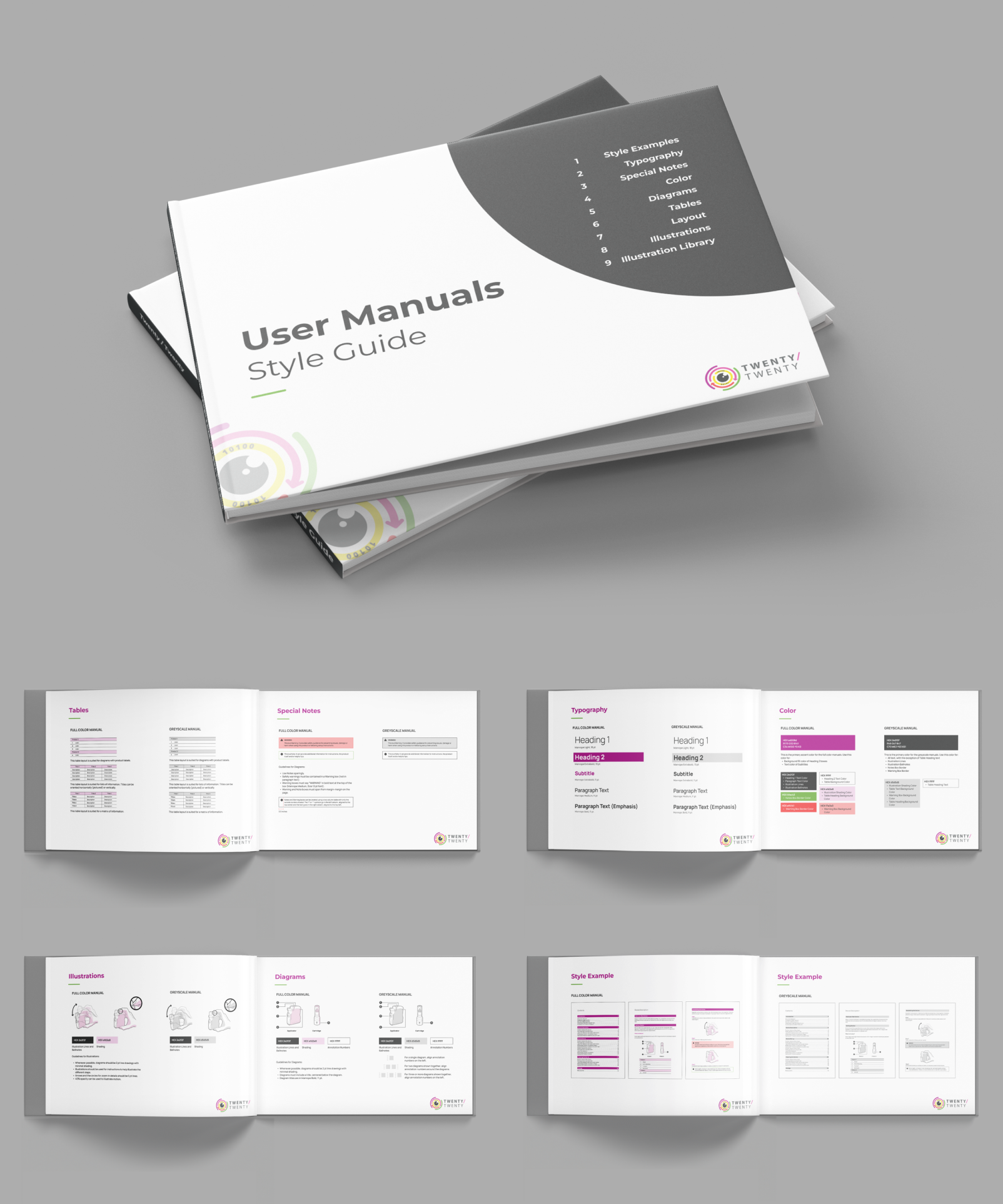
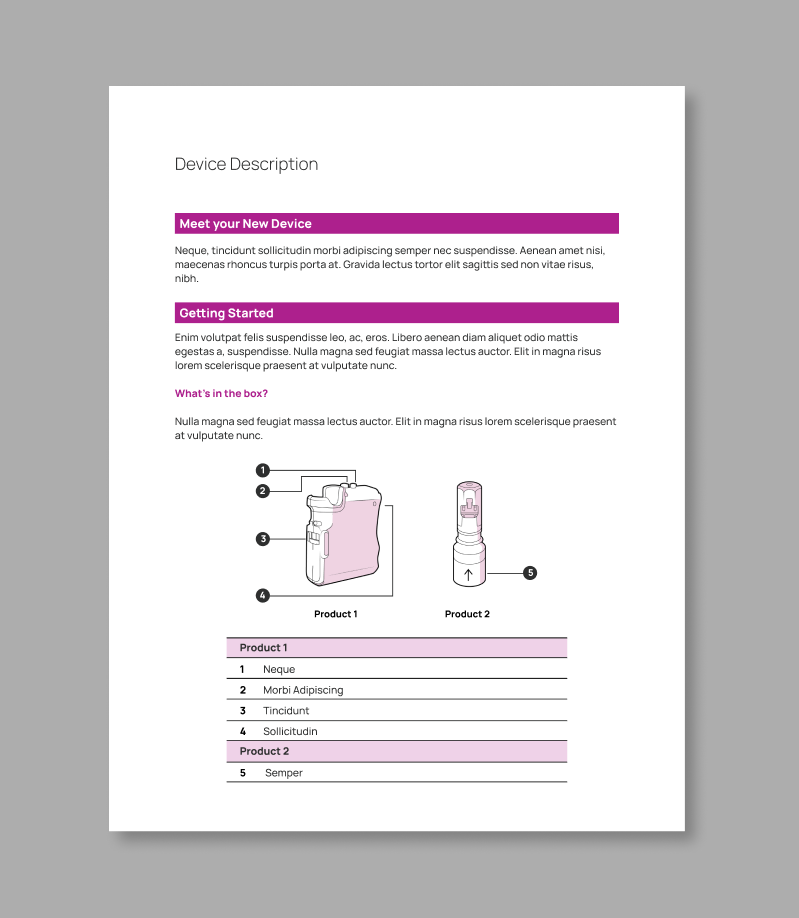
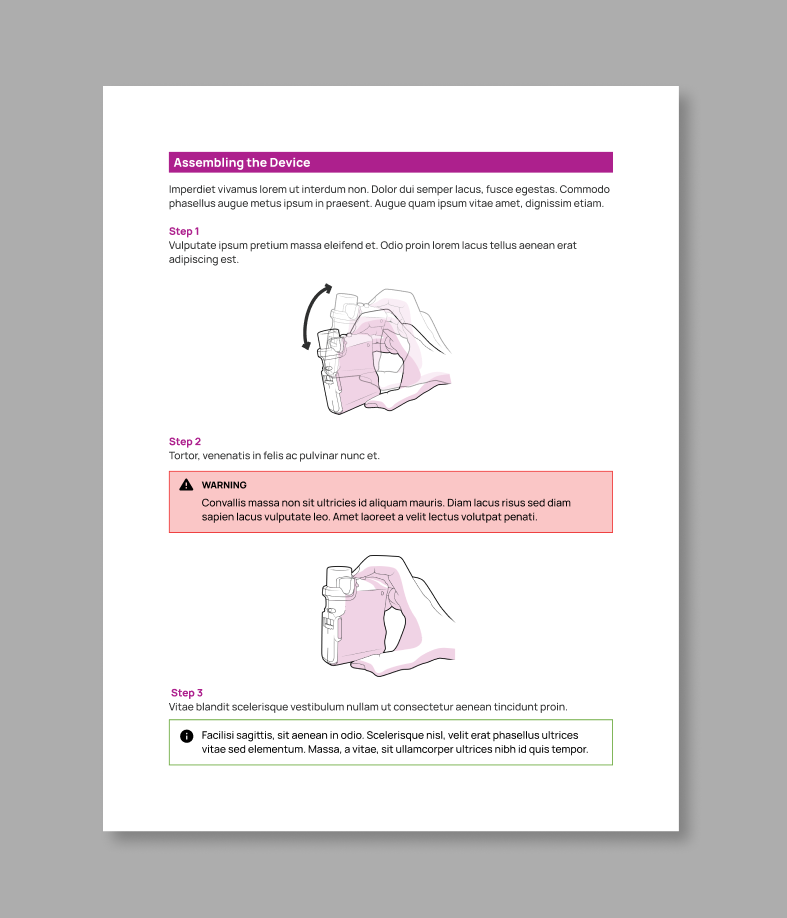
In addition to the primary style guide document, I also developed a style guide specifically for the company's Instructions for Use manuals. The company was in the process of creating multiple Instructions for Use manuals and wanted detailed guidance on how to consistently develop these. I designed a supplementary guide which gave information on how to format tables, product descriptions, instruction steps and more.

TECHNICAL ILLUSTRATIONS
Creating a Cohesive Visual Identity between Multiple Products
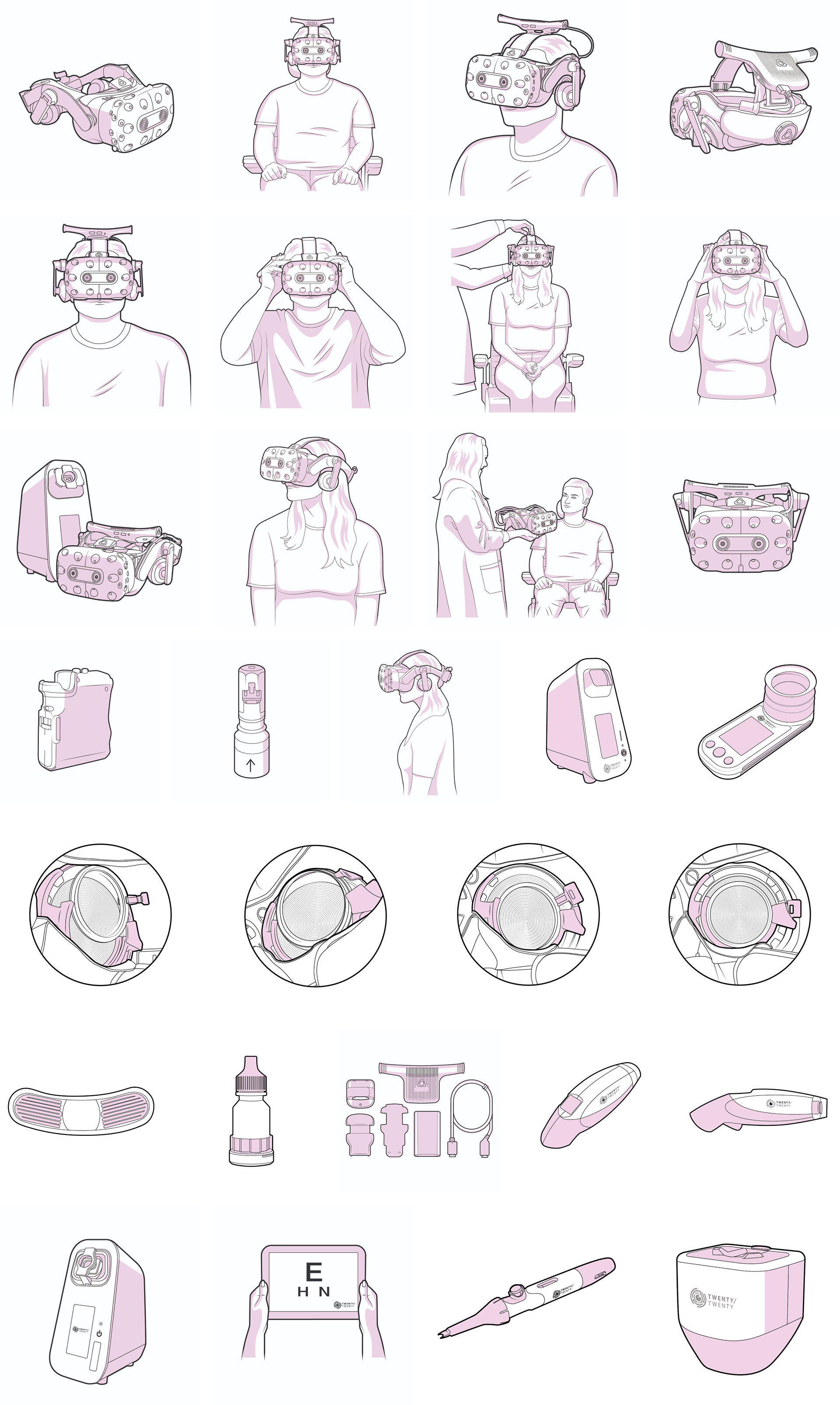
Each product in the Twenty / Twenty product line is accompanied by an Instructions for Use manual. The company needed a way to represent the products consistently across all these user manuals, while still efficiently communicating technical features of the products. In order to achieve this, I created over 50 technical illustrations for the company. The visual style was developed to connect the products under one brand and to ensure that the product features are clear.
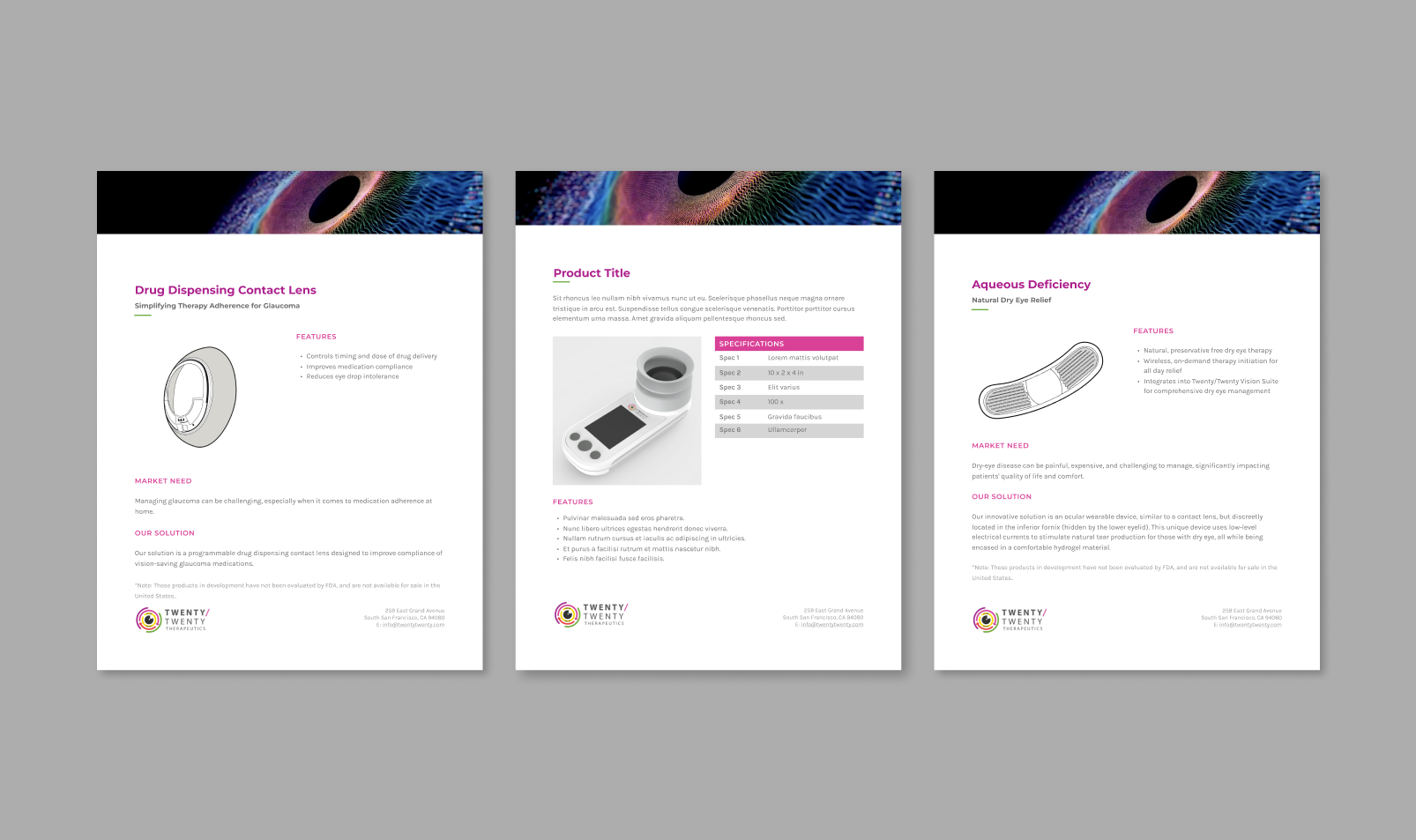
PRODUCT DESCRIPTION PAGES
The Style Guide in Action
Once the style guides were finalized, I was able to create templates for the company's printed and digital materials. I developed templates for product description pages which are used internally and for marketing purposes.